Notification Content Guidelines
Navigating cross platform messaging is not a easy task. Each platform supports different fields and different display formats. This guide will show you examples of how notifications are displayed on the most common platforms, so you can understand what works and what to expect on each.
Anatomy of a Notification
Teak provides a distinct editor for each platform, allowing you to adjust content based on platform-specific requirements. We’ll cover the different fields used by each platform, such as title, message, image, and action buttons, and explain how each is displayed in the notification.
|
Recommended Image Sizes
In the Teak dashboard, you will find suggested image sizes as help text wherever you can upload an image. If those guidelines are different from the guidelines in this document, follow the guidelines on the dashboard, and please let us know about the discrepancy. |
iOS Push Notifications
On iOS, there are two views, default and expanded. All notifications are intially shown in the default size, and the Expanded view is only show if the user taps and holds on the notification to expand it.
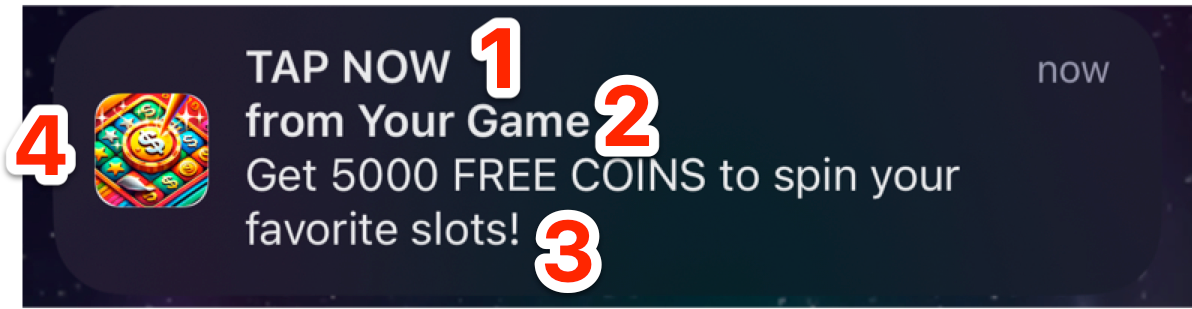
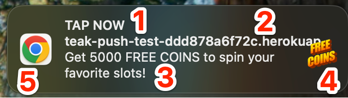
iOS small/unexpanded notification |
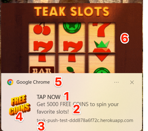
iOS large/expanded notification |

|
|
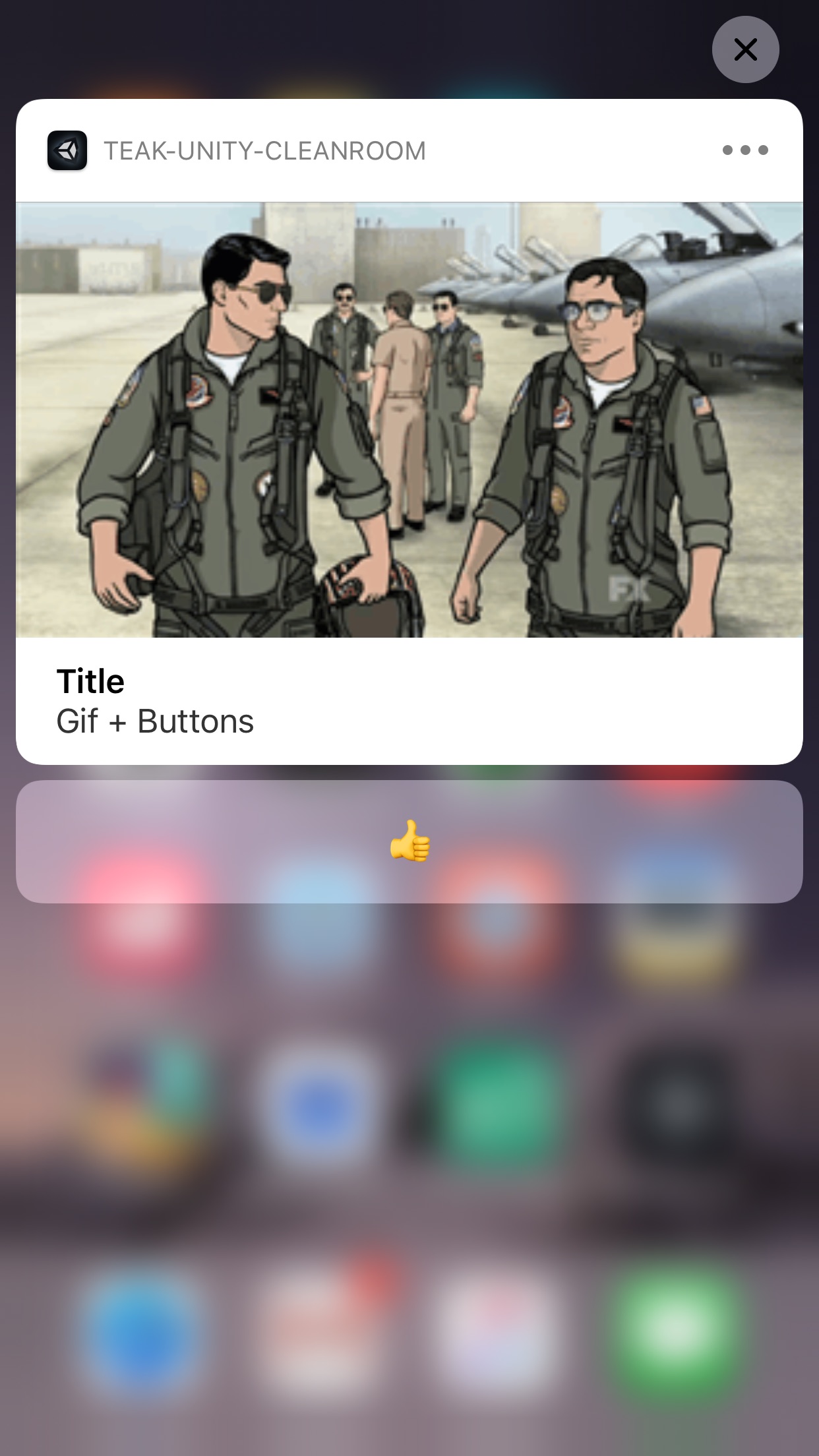
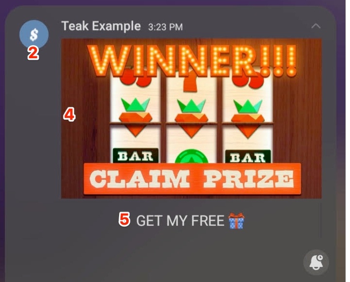
1) Title 2) Subtitle 3) Message 4) Thumbnail 5) App Icon 6) Expanded View 7) Buttons |
|
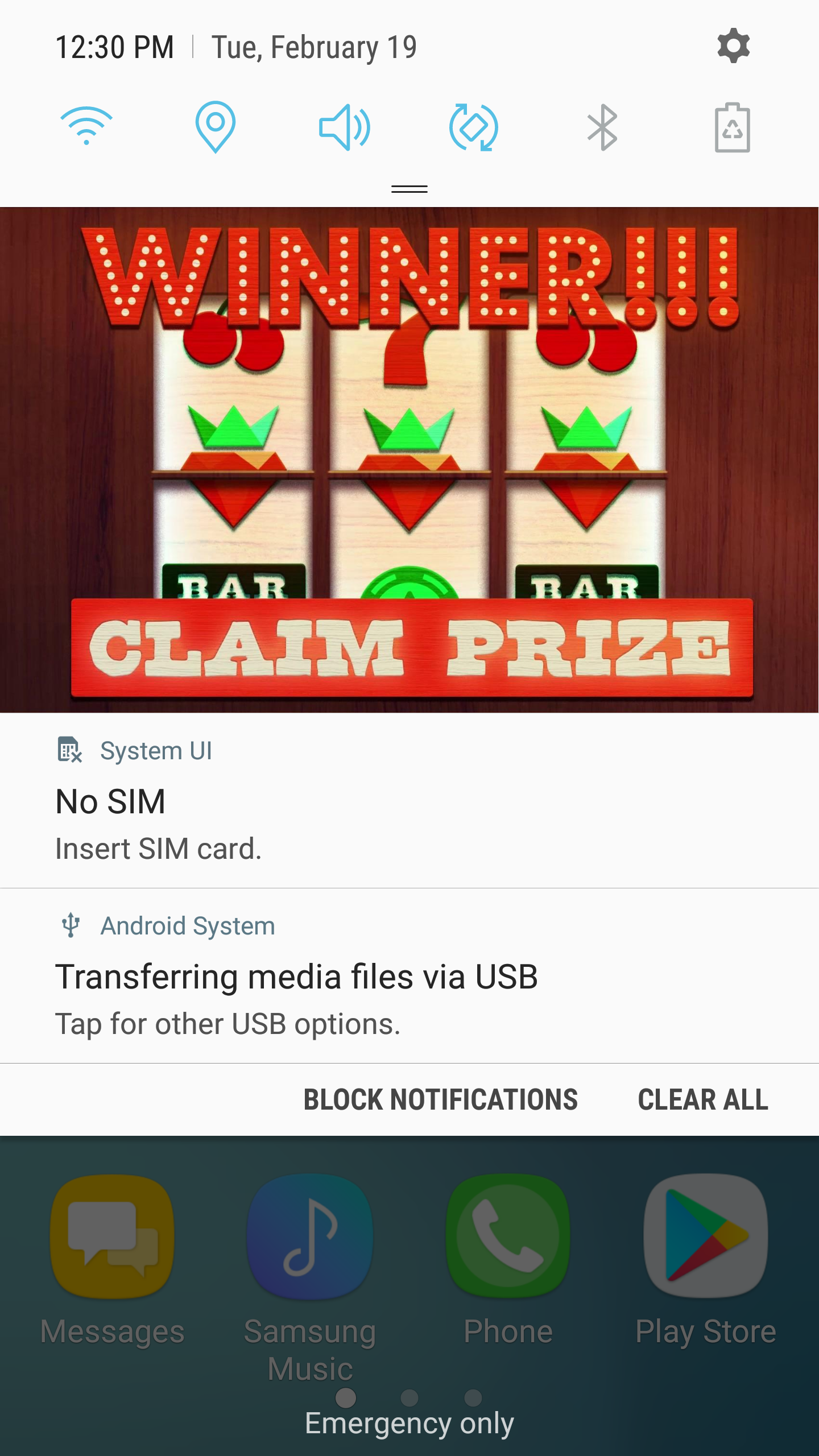
Android Push Notifications
On Android, Teak offers 2 different layouts: Default and 'iOS Style'. Each of these has a standard view and an expanded view as well.
Default Android Layout
On Android, default notifications can be text, or a full width image.
Android small/unexpanded notification |
Android large/expanded notification |
Message Only
|
|
With Background Image
|
|
1) Message 2) Badge 3) Banner Image 4) Expanded View 5) Buttons |
|
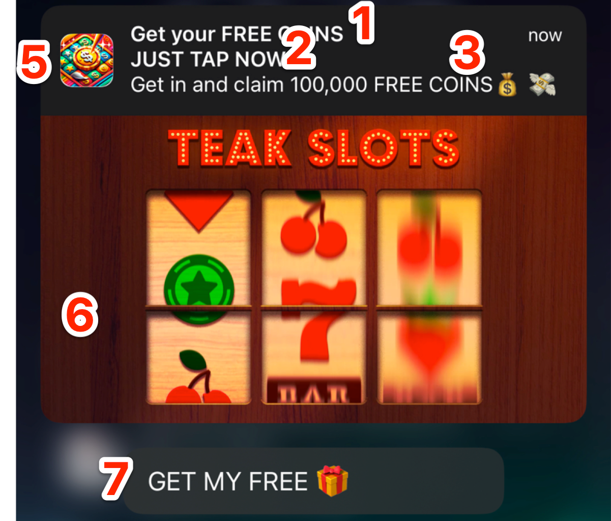
Android 'iOS Style' Layout
Teak also offers a custom Android notifications layout that is designed to look like the iOS notification with a thumbnail. This is useful when you want to reuse the same art assets across both platforms.
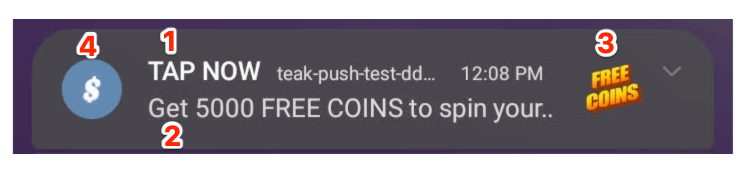
Android small/unexpanded iOS Style notification |
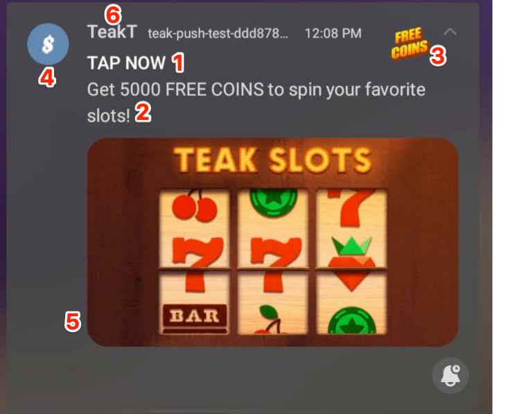
Android large/expanded iOS Style notification |
With Subtitle (bolded second line)
|
|
With Message Only
|
|
1) Title 2) Subtitle 3) Message 4) Thumbnail 5) Badge 6) Expanded View 7) Buttons |
|
Web Push on Mobile
Web browsers on mobile are an important platform to consider for Web Push. Here, we find even more combinations of platforms and browsers. For now, we will only cover the most common ones. Safari on iOS and Chrome on Android.
We’ll cover Chrome on both Mac and Windows in the desktop/web section later.
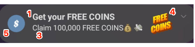
Safari iOS Web Push Layout
Web Push on iOS Safari does not support thumbnails or an expanded view.
| iOS Safari Web Push notification |
|---|
|
1) Title 2) App Name 3) Message 4) App Icon |
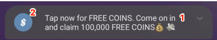
Chrome Android Web Push Layout
Set up the badge image on the settings page of the Teak Dashboard.
Android Chrome Web Push small/unexpanded |
Android Chrome Web Push large/expanded |
|
|
1) Title 2) Message 3) Thumbnail 4) Badge 5) Expanded View 6) App Name |
|
Desktop Web Push Notification Styles
Different browsers can display notifications slightly different on desktops. But they are all limited by the notifications that the OS supports. For now, we’ll only look at Chrome for Mac and Windows. If you have players using other browsers, we recommend testing those as well.
| If you would like to see another browser/OS combo documented, just ask. |
Android Image Safe Areas
Android device vendors customize hardware and software, resulting in variations in screen sizes, aspect ratios, and display features, which causes images to be cropped differently across devices.
To account for these differences, we refer to a 'safe area' within an image. This is the region where critical content, such as text, should be placed to ensure it is always visible. The area outside the safe area may be cropped on some devices but not others.
We established the safe area guidelines by using test pattern images and pixel grids on numerous different Android devices to establish image sizes that will maintain aspect ratio, and determined the safe areas inside those sizes in which the content will always be displayed.
Android Banner View
The banner view of an Android Notification is used in both the toast view, and the notification center.
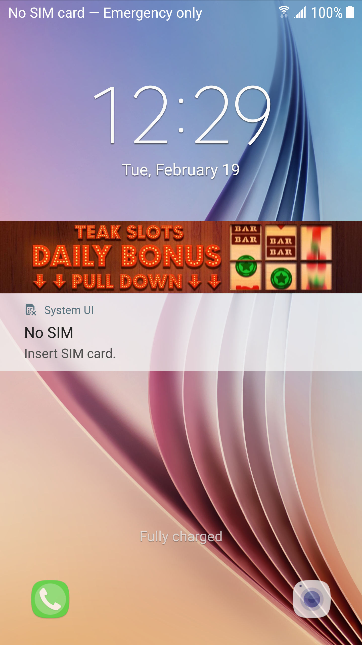
Android Banner View on Lock Screen
|
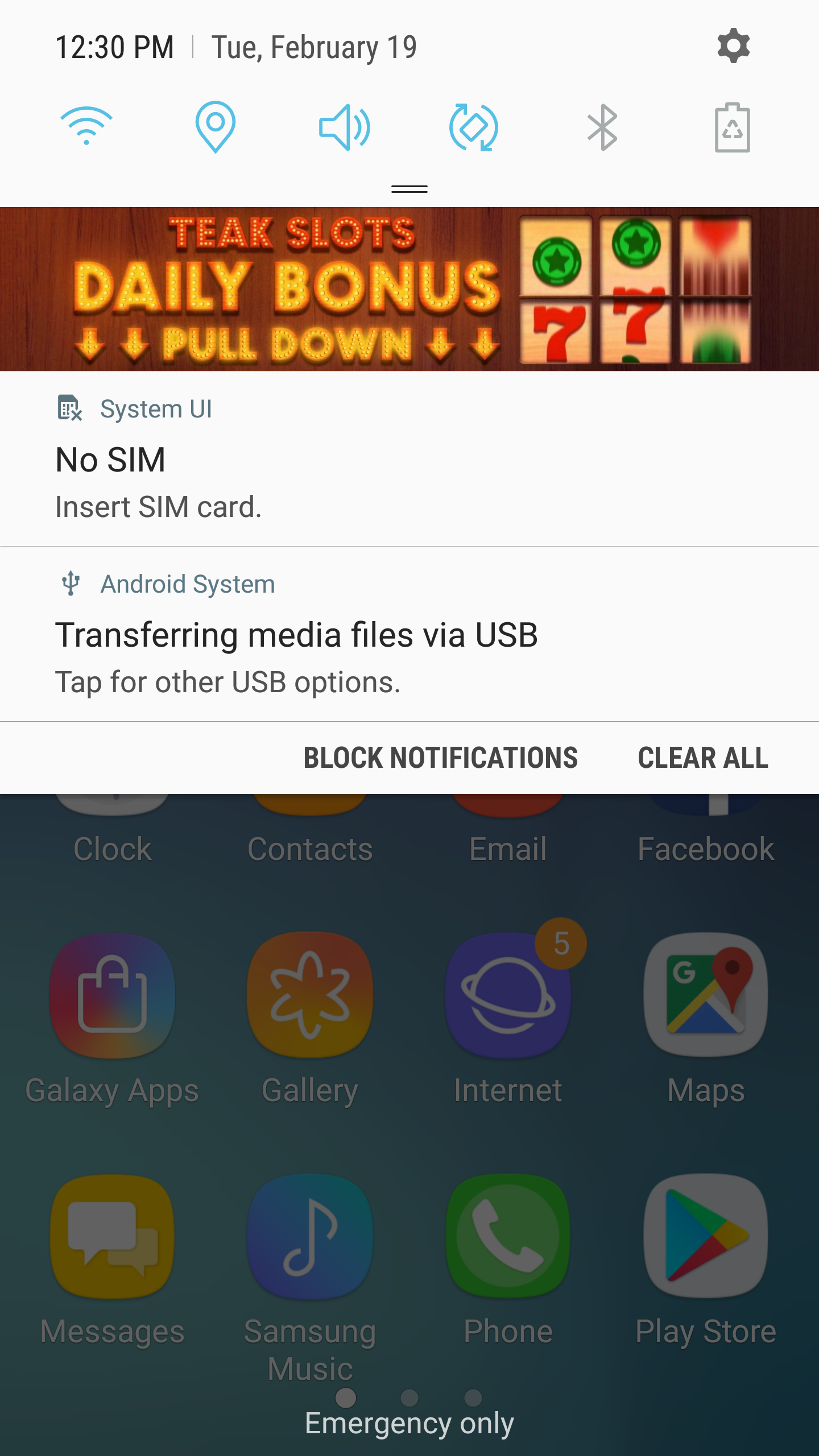
Android Banner View in Notification Tray
|